Project Overview
Yummee Treats is a local dessert shop known for its oversized, chunky cookies and handcrafted beverages. While the business had built recognition within the community, its original identity no longer reflected its fun, welcoming personality. The green and red color palette unintentionally created a holiday-themed appearance, limiting the brand's year-round appeal. In addition, the logo lacked consistency and did little to communicate the shop's signature products or playful character. The goal of this rebrand was to create a more memorable, approachable identity that better represented the experience of visiting Yummee Treats.
Design Direction:
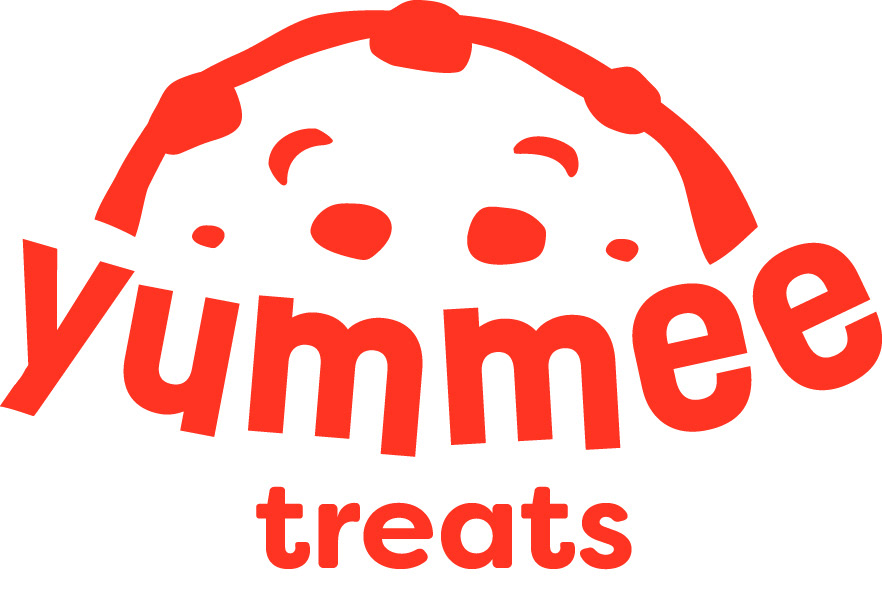
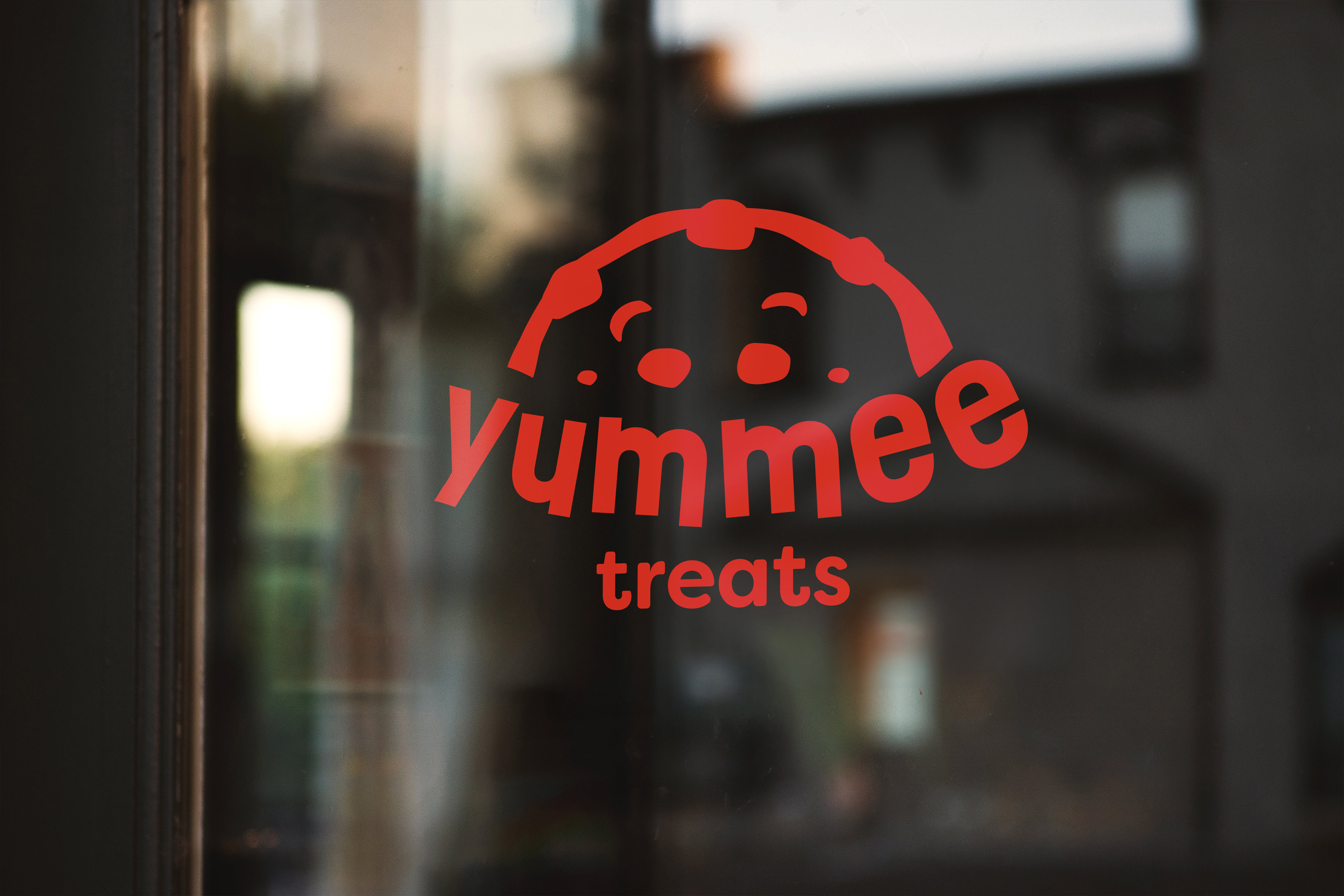
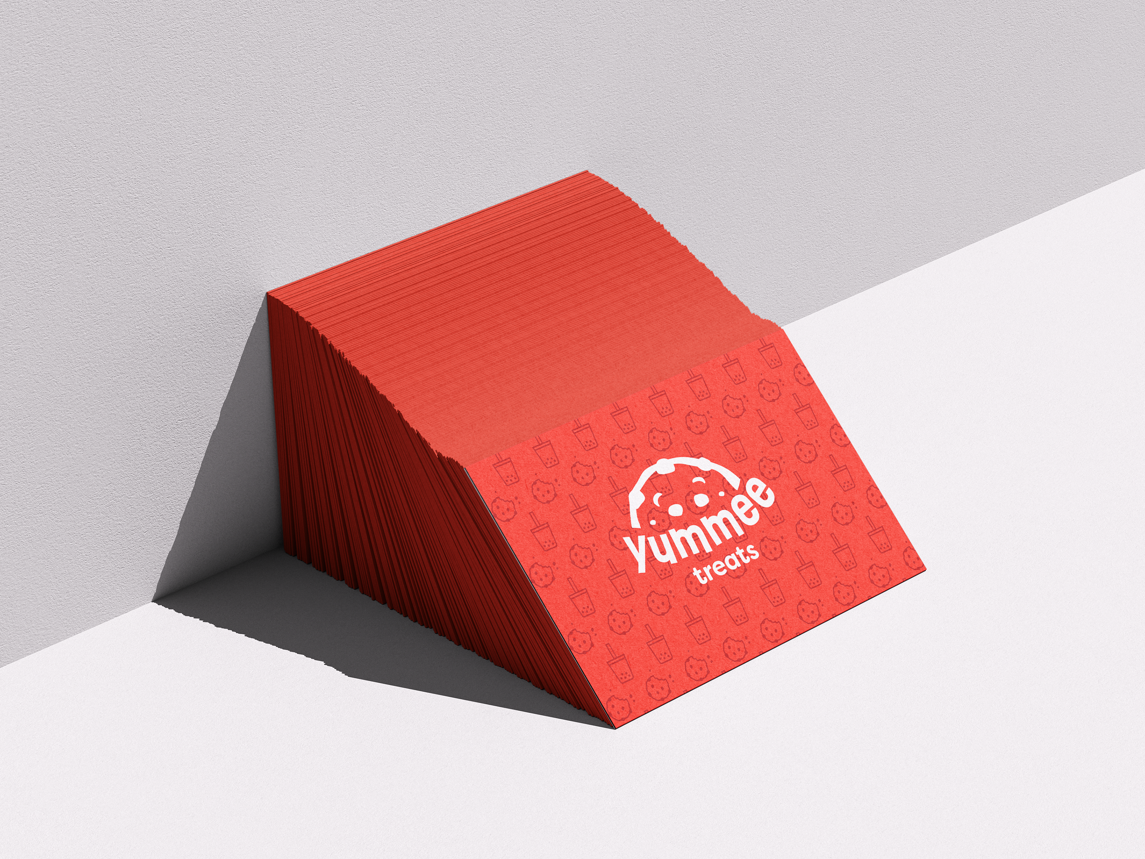
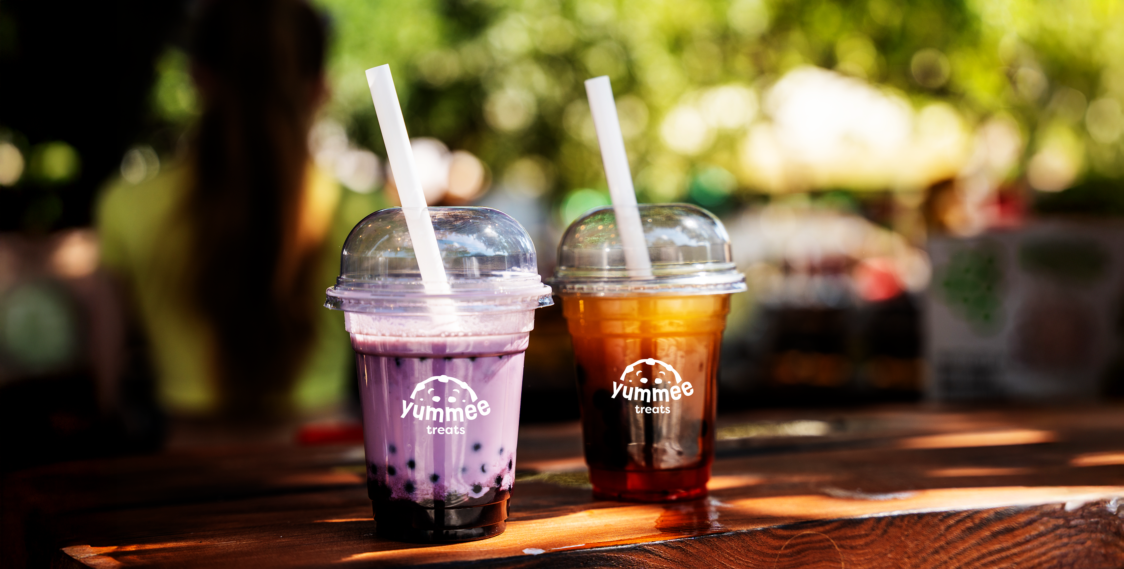
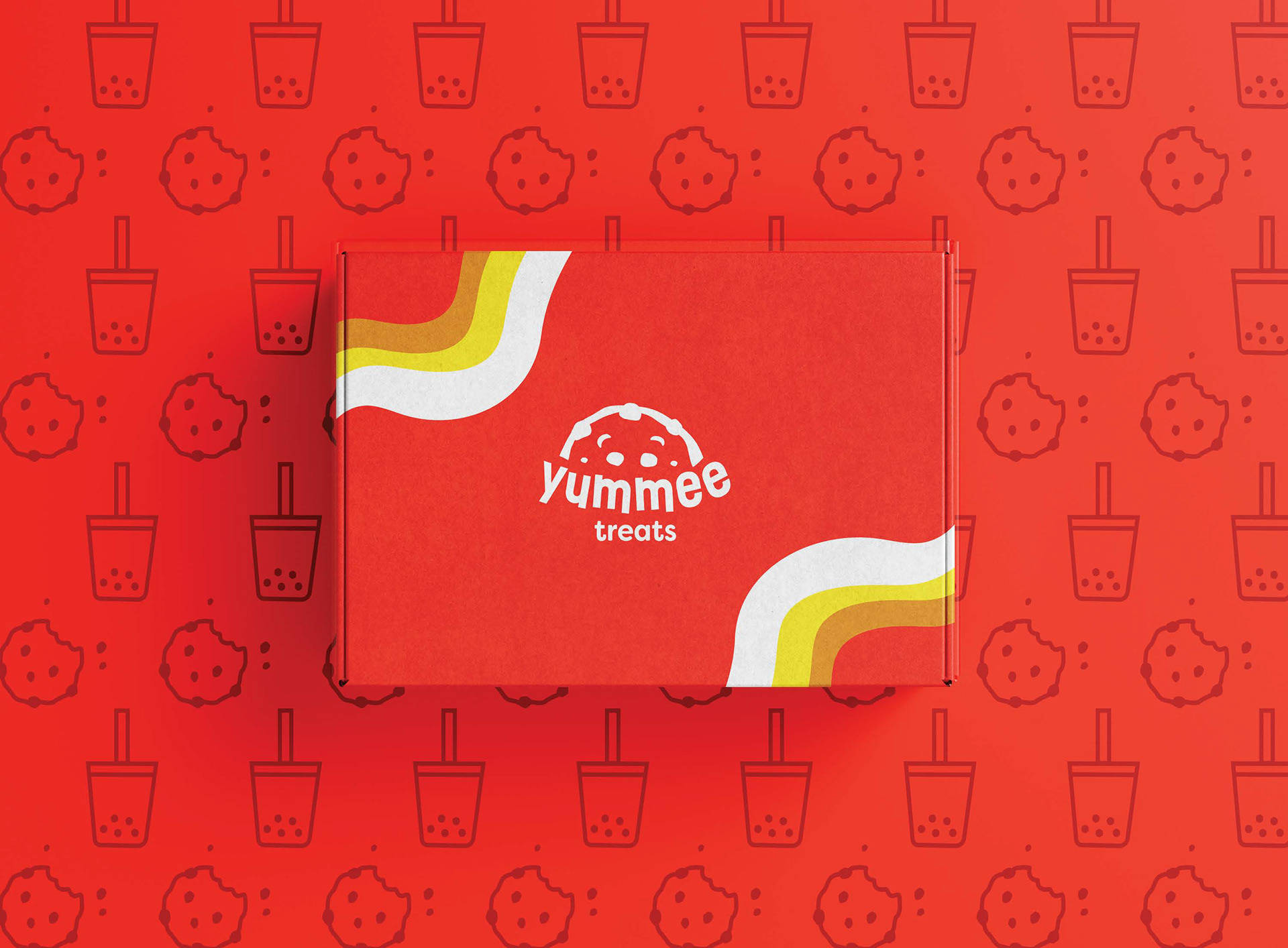
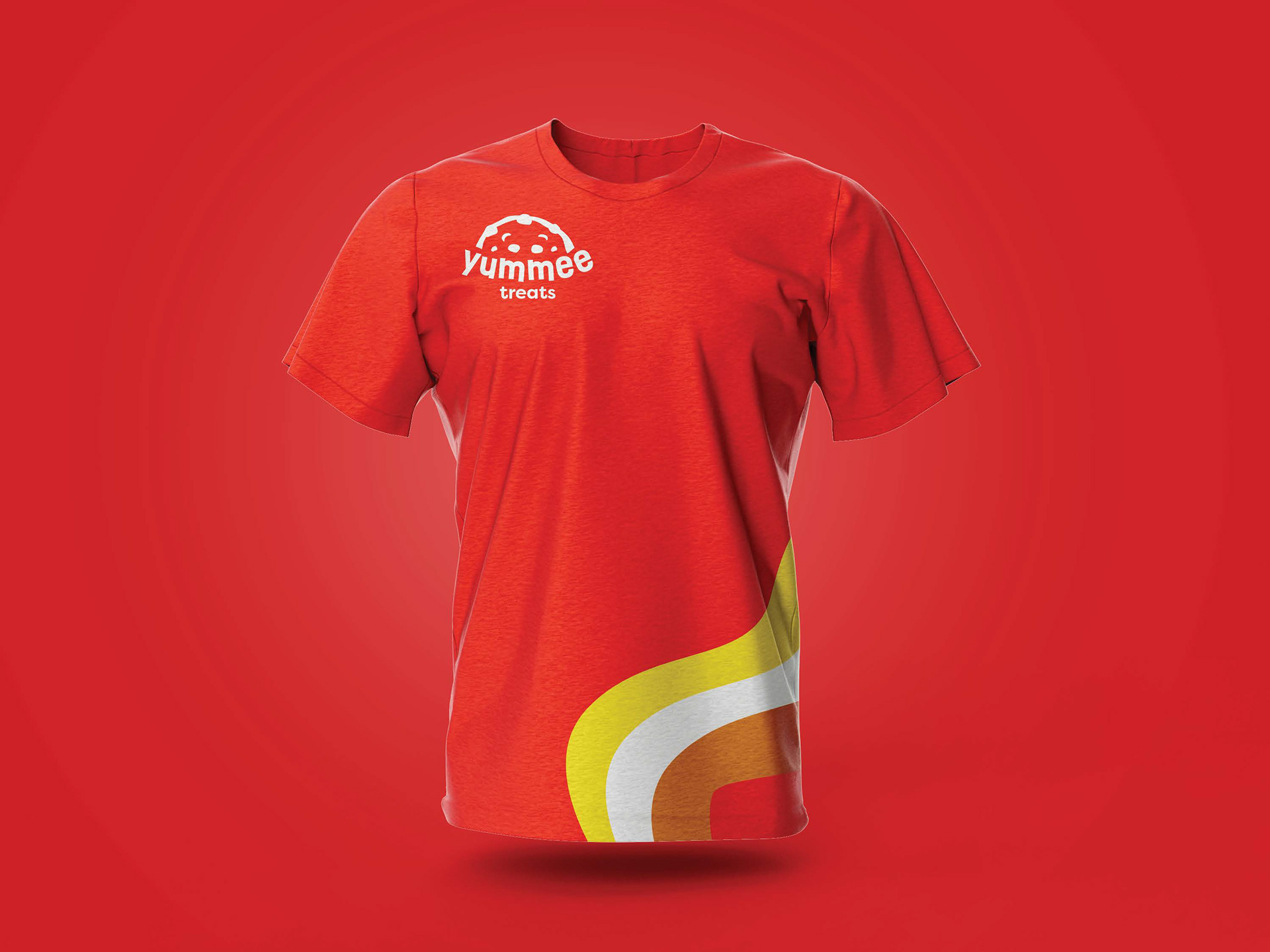
The redesign focused on creating a warm, playful identity inspired by the shop's signature chunky cookies. The holiday-inspired green was replaced with a palette of rich reds, warm oranges, and golden yellows to evoke freshly baked desserts and create a more inviting brand presence throughout the year. A bold, rounded wordmark paired with an oversized cookie icon reinforces the bakery's most recognizable product while adding personality and memorability. The identity was then extended across packaging, environmental graphics, merchandise, and beverage applications to establish a cohesive visual system that enhances brand recognition across every customer touchpoint.
Old Logo
Redesigned Logo